Claire Ashford Consulting
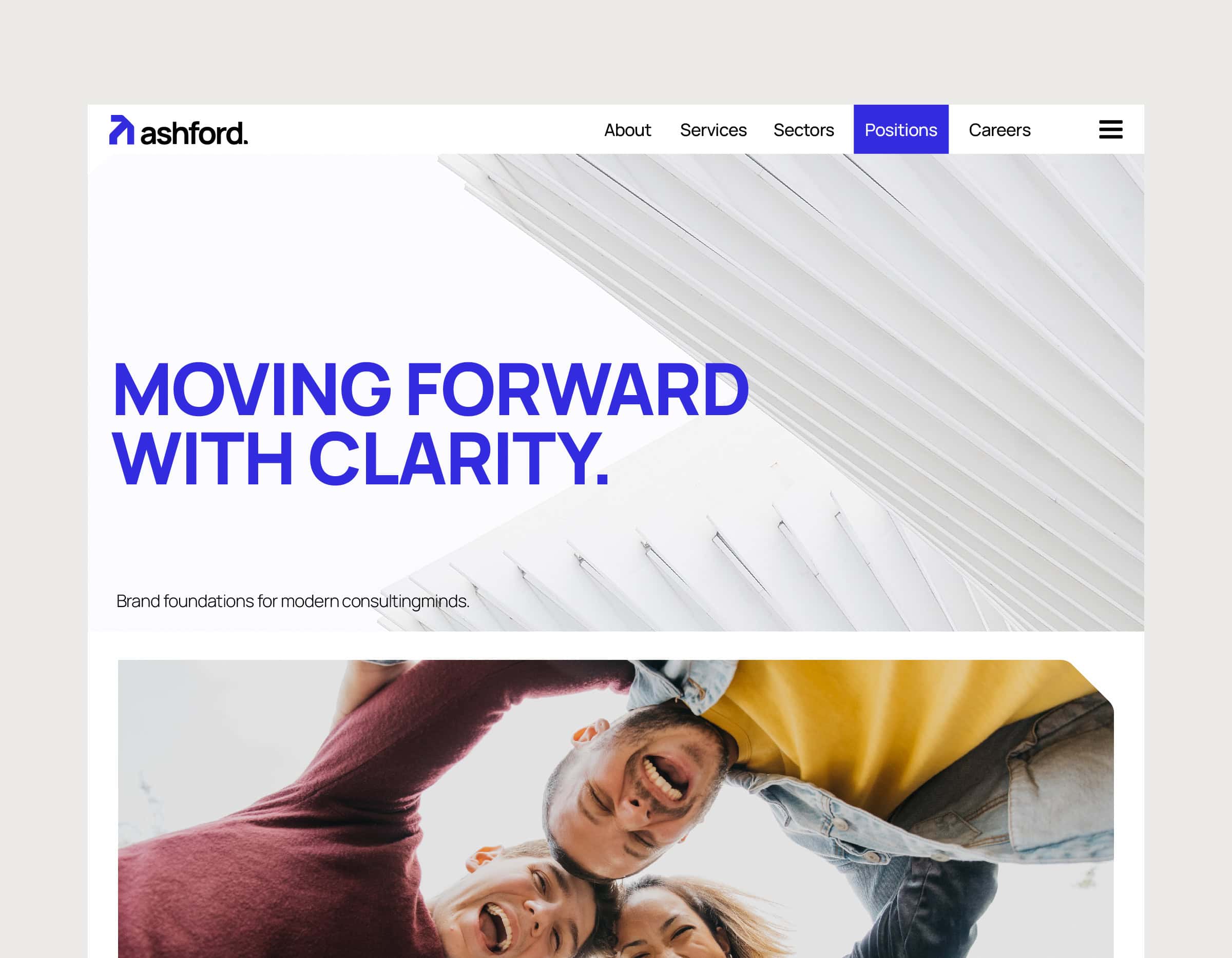
Claire Ashford Consulting approached us with a challenge: to craft a brand identity that functions as an internal alignment tool for their consulting team. This wasn’t just about visuals — it was about creating a unified consultant brand that reinforces trust, clarity, and direction across the company.
Through workshops and collaborative design sprints, we developed a flexible and human-centered branding system that empowers every employee — from leadership to sales — to communicate with confidence and coherence. The result is a scalable consultant brand identity designed for long-term cultural alignment and external credibility.
Task
Build a scalable consultant branding system that acts as an internal alignment tool and external brand asset. The outcome was a cross-functional identity platform adopted through strategy, play, and clarity.

Consultant Branding Challenges
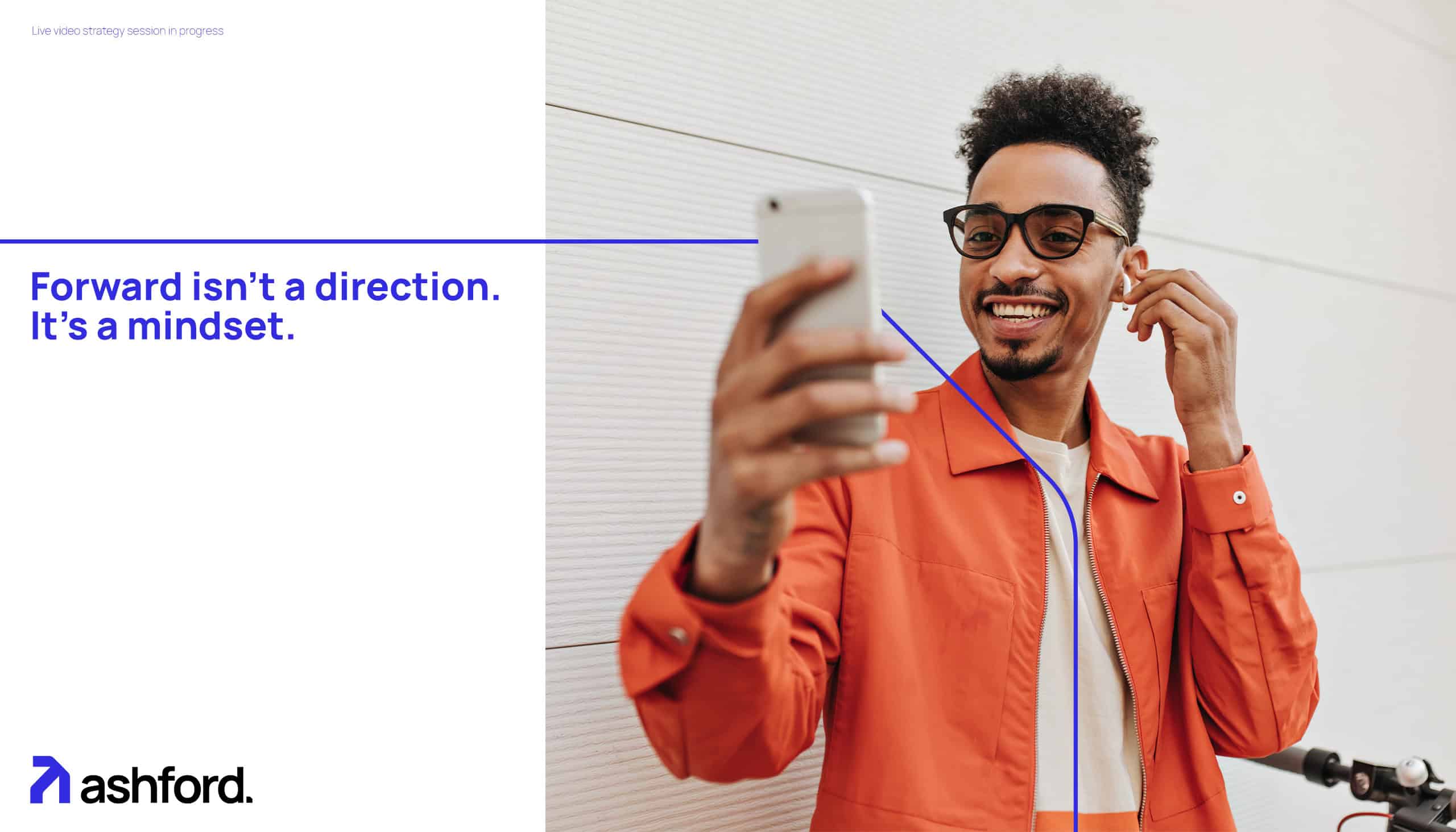
Claire Ashford Consulting is a rising name in consultant branding, helping strategy-led professionals build clarity and confidence through design. As a growing consulting firm, Claire needed a branding strategy that communicates trust, expertise, and relevance across business sectors.
We created a full consulting brand identity system—including naming, verbal direction, logo design, and a visual toolkit—tailored to elevate consultants’ communication and set Claire Ashford apart in the competitive landscape of professional brand development.
Consultant Branding Experience
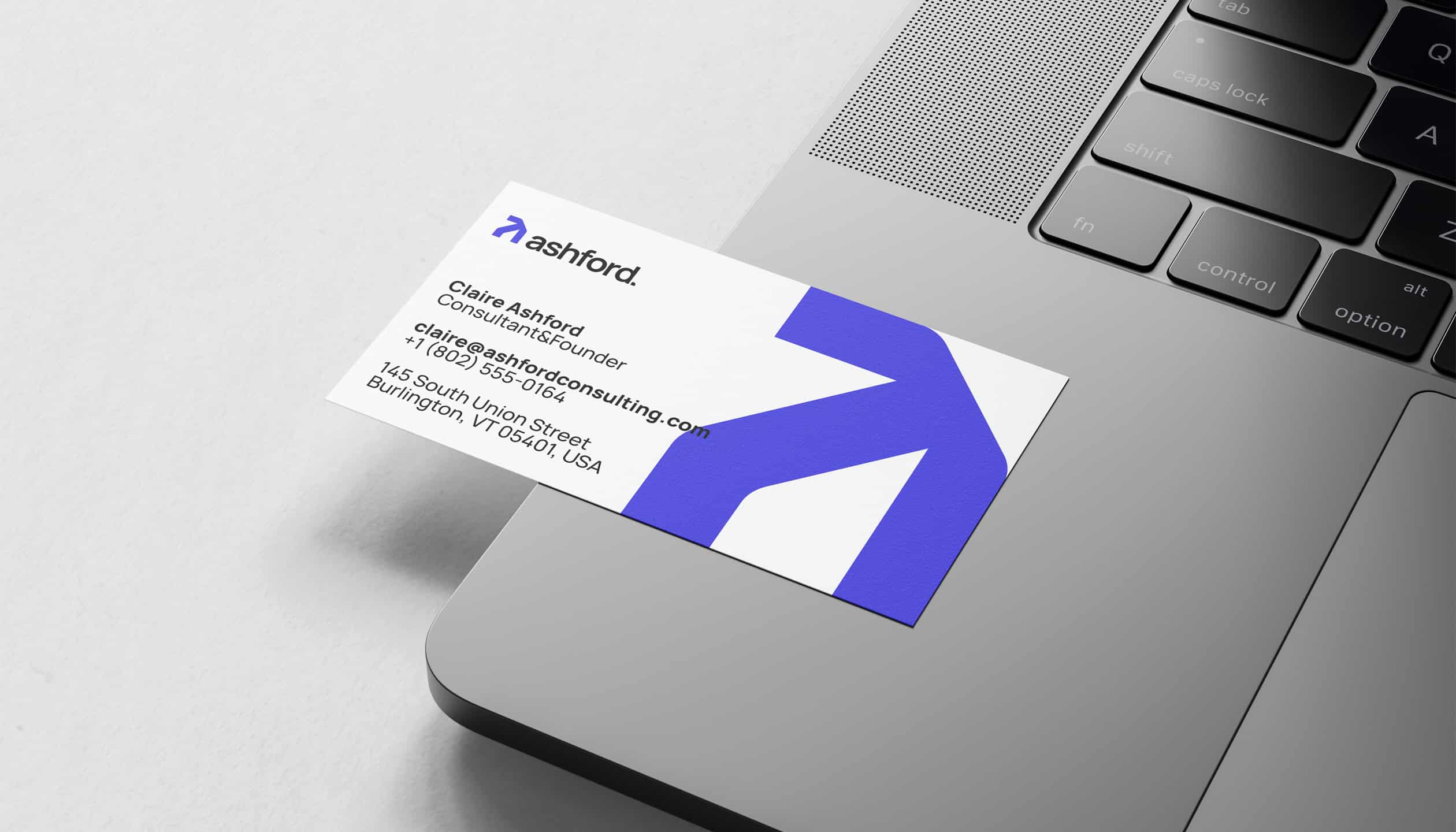
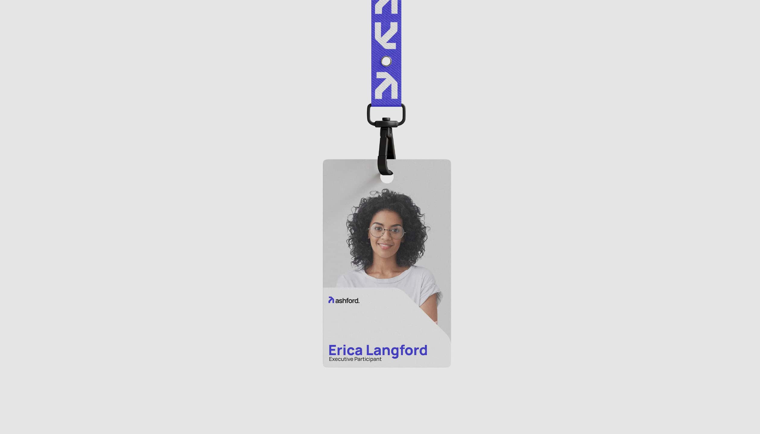
We developed a comprehensive consultant branding system for Claire Ashford, aligning visual identity with her core values and professional tone. From the logo and color palette to typography and layout principles, the brand communicates clarity, trust, and modern expertise.
User experience was crafted with precision, aligning every brand interaction with the values of high-level consultant branding. The result is a consistent and intuitive identity across all digital and physical touchpoints.


| Primary #F71C1C |
◯ |
|
| R 50 G 44 B 223 |
Insight Blue
| Accent #000000 |
◯ |
|
| R 0 G 0 B 0 |
Black
| Secondary #D6D6D6 |
◯ |
|
| R 235 G 234 B 233 |
Clarity Gray
| Neutral #FFFFF |
◯ |
|
| R 255 G 255 B 255 |
Pure Canvas
Insight Blue leads the visual identity—symbolizing clarity, trust, and direction. Paired with Clarity Gray and Pure Canvas, the palette reflects the structure and space consultants bring to transformation.
In consultant branding, colors carry meaning. Insight Blue signals confidence and focus, while neutral tones leave room for strategic messages. Together, they shape a sense of order and ambition.
Typeface
MANROPE BOLD
Usage
Headlines
Typeface
MANROPE MEDIUM
Usage
Body Text
Typeface
MANROPE EXTRALIGHT
Usage
Secondary Text
Digital Presence