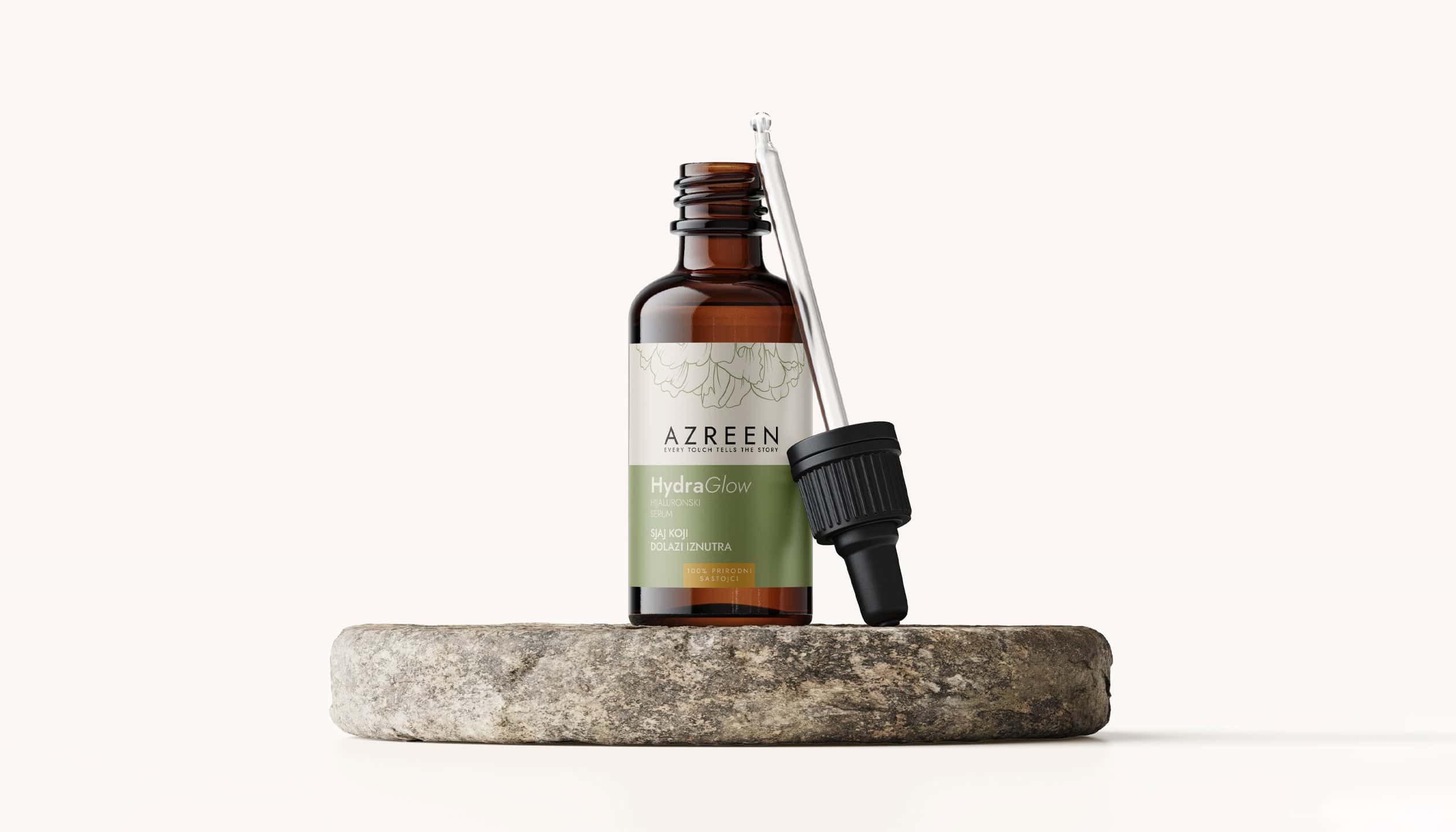

AZREEN Cosmetics
Azreen Cosmetics approached us with a challenge: to design natural skincare packaging that reflects the warmth, purity, and emotional story behind the brand. The goal was to craft a cosmetic packaging design that feels clean, intentional, and grounded in nature.
This wasn’t just about surface beauty — it was about creating a label design for cosmetics that communicates trust, softness, and authenticity through visual storytelling. Subtle gradients, botanical line illustrations, and earthy tones were used to bring that vision to life.
By blending emotional messaging with premium aesthetics, we developed a natural skincare branding system that works across both label and box packaging. The result is a calming, elegant packaging solution that supports Azreen’s mission: “Every touch tells a story.”
Task
Design a label and outer packaging for Azreen’s cosmetics — focusing on natural skincare branding with emotional storytelling and a clean, premium visual feel.
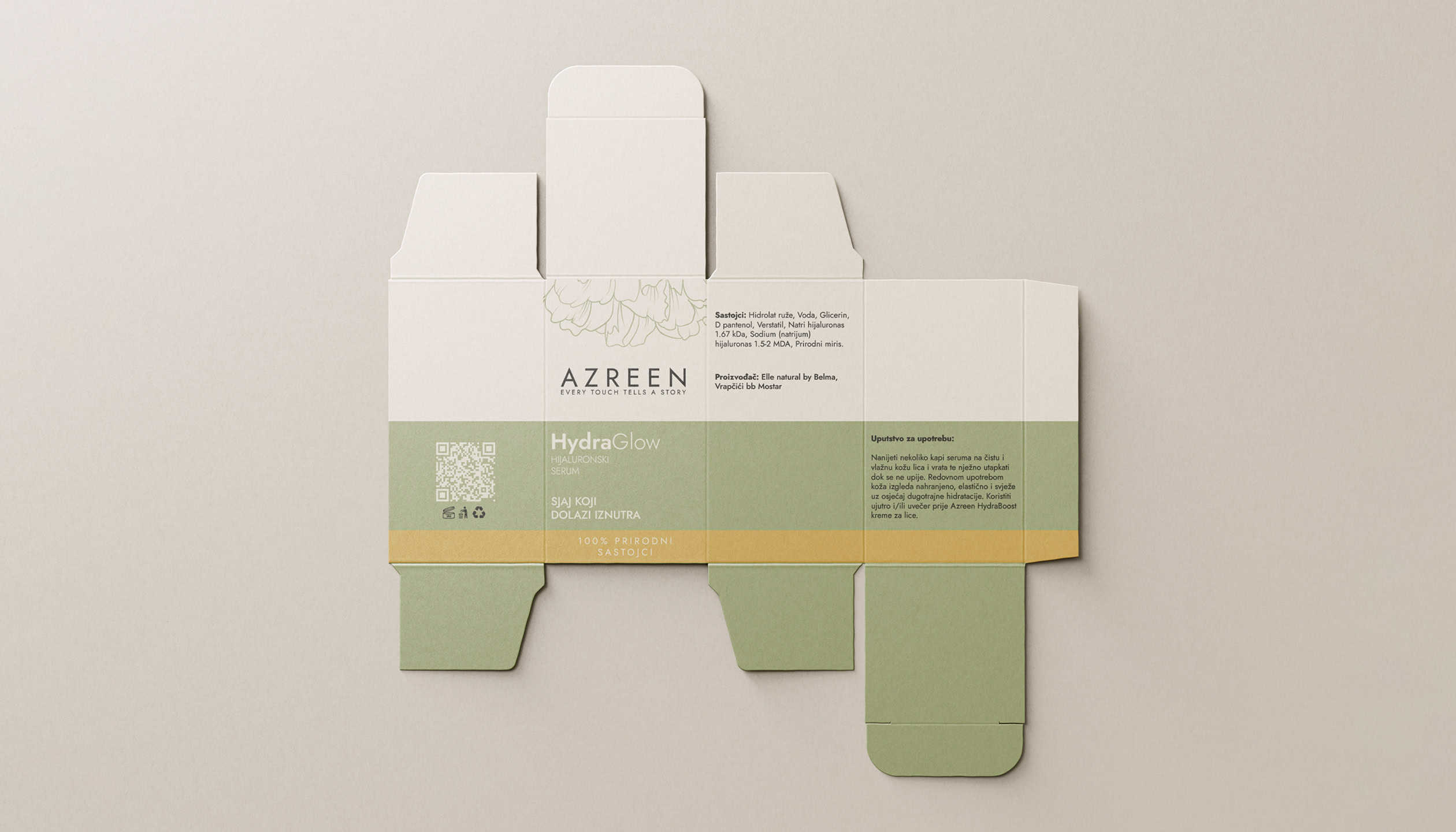
Skincare Packaging with Purpose
Azreen is a cosmetics brand rooted in authenticity, memory, and touch. Inspired by the founder’s personal story, it focuses on natural skincare, emotional value, and quiet luxury.
The goal was to design packaging that feels both personal and premium — evoking trust, warmth, and care with every interaction.
We designed a label and box system that balances clarity and softness — featuring minimalist typography, botanical illustrations, and natural hues.
This packaging design helps Azreen stand out on the shelf while reinforcing its identity as a clean beauty brand built on storytelling, intention, and skin-loving ingredients.
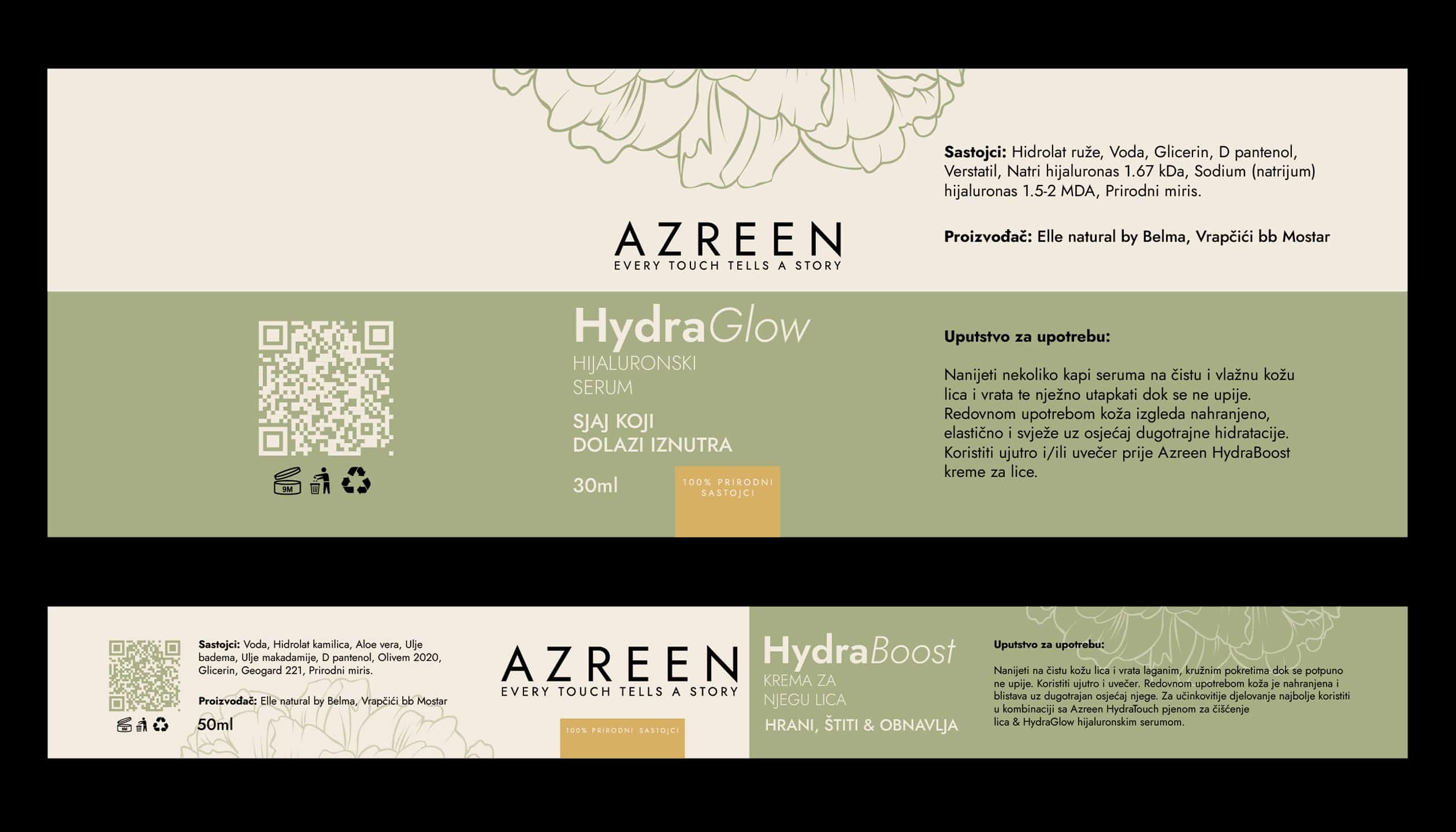
The Essence of Natural Care
Azreen delivers skincare branding that blends nature, science, and emotional storytelling.
Our approach transforms products into experiences — elevating natural cosmetics through design that feels authentic, calming, and memorable.
We create a consistent brand presence across packaging, digital media, and visual communication — helping customers instantly connect with the idea of care, purity, and trust.

| Primary #A8AF85 |
◯ |
|
| R 168 G 175 B 133 |
Olive Dew
| Accent #F3EBDF |
◯ |
|
| R 243 G 235 B 223 |
Soft Alabaster
| Secondary #D8B164 |
◯ |
|
| R 216 G 177 B 100 |
Golden Clay
| Neutral #000000 |
◯ |
|
| R 0 G 0 B 0 |
Velvet Noir
Olive Dew brings a sense of grounded calm and natural purity to Azreen’s skincare identity. When paired with Golden Clay and Velvet Noir, the palette balances softness with quiet strength — evoking trust, warmth, and subtle luxury. This color story reinforces Azreen’s commitment to gentle skincare and emotional storytelling through design.
In premium skincare branding, color is more than visual — it creates emotional connection. Olive Dew and Soft Alabaster reflect purity and softness, while Golden Clay adds warmth and glow. Velvet Noir anchors the palette with elegance and clarity, helping Azreen stand out in a saturated beauty market with a clean, soulful, and memorable visual language.
Part of Something Natural