Nuvelo Estate
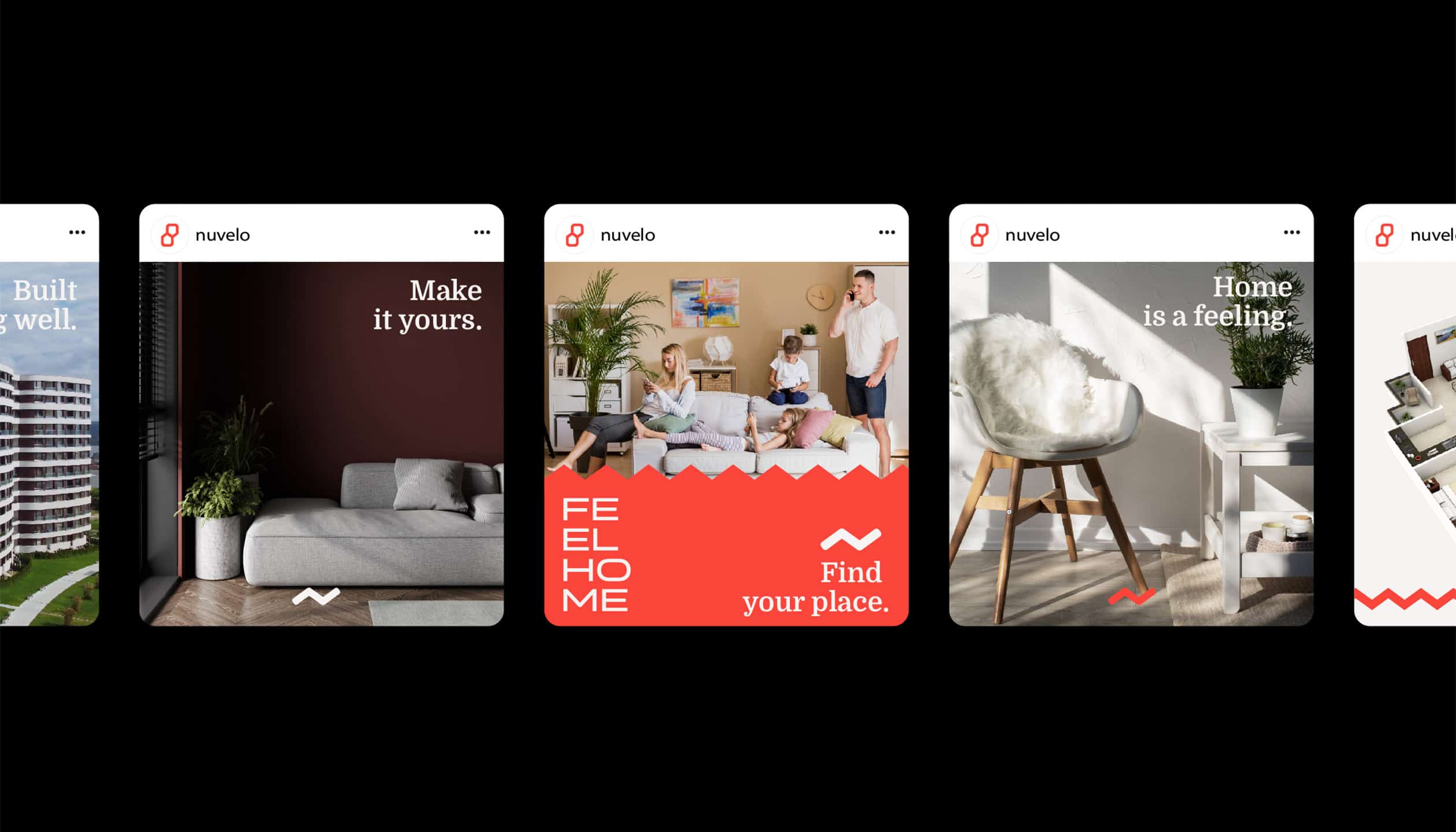
Nuvelo Estate approached us with a challenge: to create a real estate branding system that would go beyond a simple logo or visual style. The goal was to craft a property branding solution that communicates warmth, trust, and a distinctive presence in a competitive housing market. This wasn’t just about aesthetics — it was about building a human-centered brand strategy that positions Nuvelo as a leader in real estate marketing while creating an emotional connection with its audience.
Through in-depth workshops and collaborative design sprints, we developed a flexible visual identity system that works seamlessly across print, digital, and outdoor advertising formats. The result is a scalable real estate brand identity designed to highlight Nuvelo’s core values — home, comfort, and intentional living — while ensuring consistency and recognition across all channels.
Task
Build a scalable real estate branding system that acts as both a strategic marketing tool and a consistent visual identity platform. The outcome was a cross-functional brand system adopted through strategy, storytelling, and design clarity.


Real Estate Branding Challenges
Nuvelo Estate is redefining real estate branding by helping property-focused businesses create brands that feel personal, trustworthy, and instantly recognizable. In a competitive housing market, Nuvelo needed a brand strategy that communicates warmth, expertise, and a unique identity — making every interaction feel like the first step towards home.
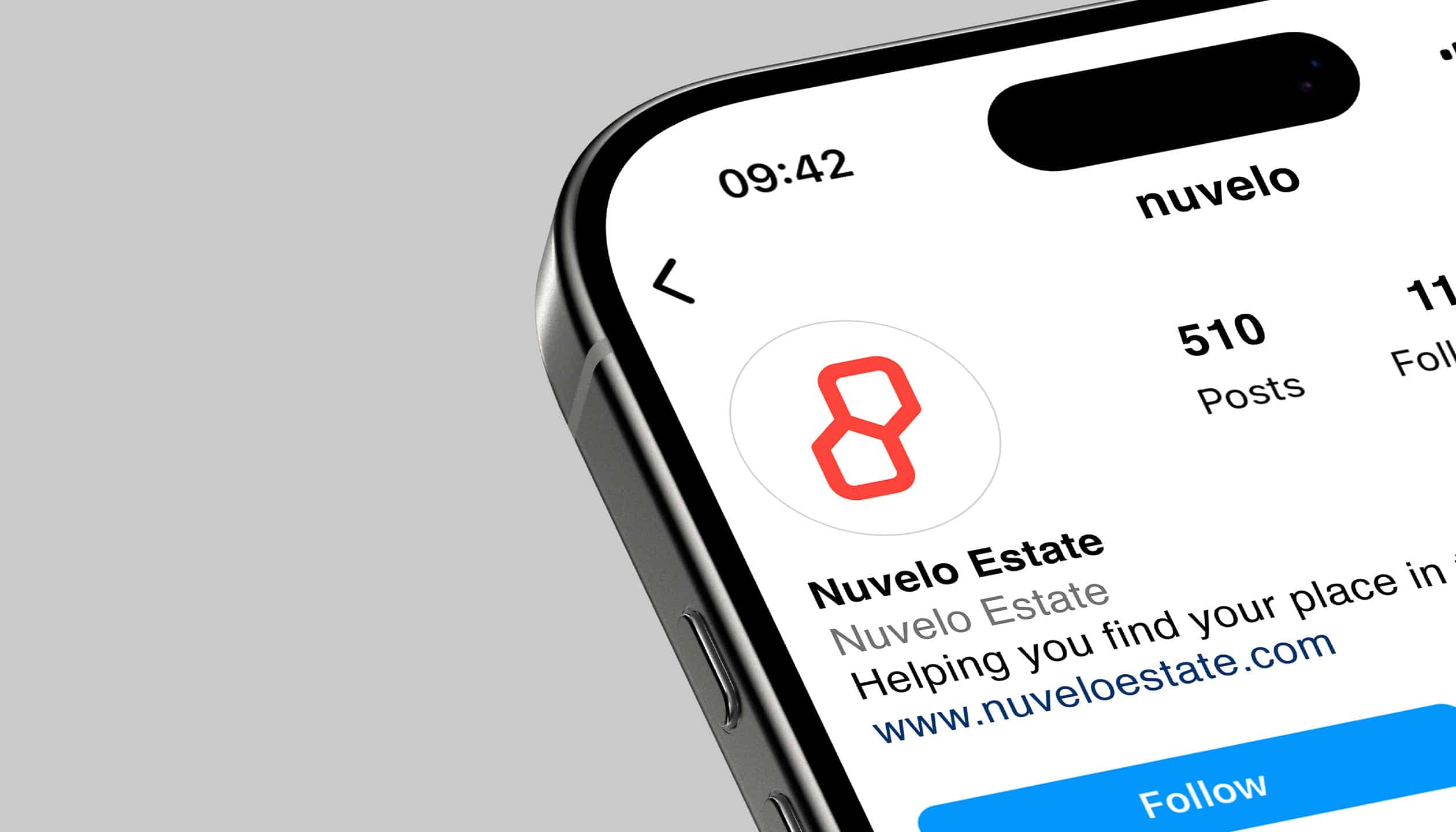
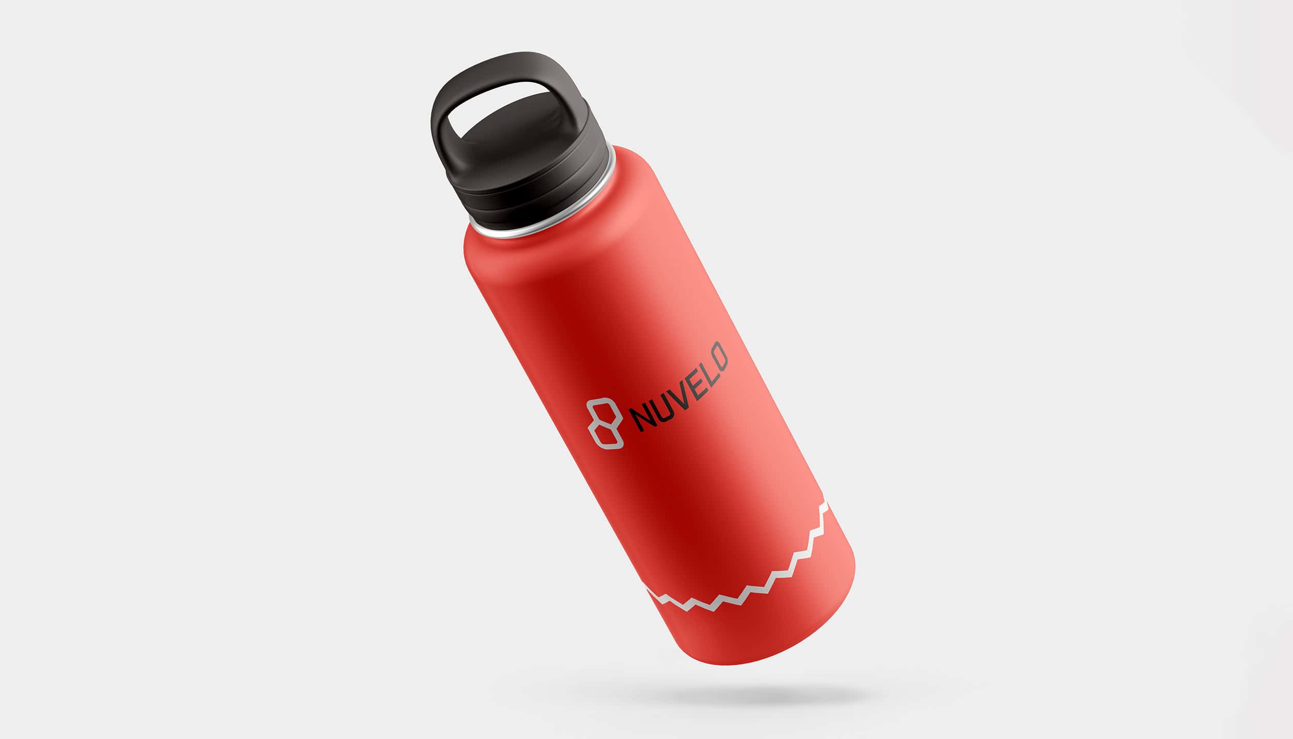
We developed a complete property branding and visual identity system — including logo design, brand color palette, typography, messaging framework, and a versatile visual toolkit — tailored to work seamlessly across print, digital, and outdoor advertising. This approach ensures that Nuvelo’s real estate marketing not only stands out but builds a consistent and emotional connection with buyers, renters, and the community.
Real Estate Branding Experience
Nuvelo Estate delivers real estate branding that blends modern design with emotional connection. Our approach transforms properties into memorable brands through a cohesive visual identity and strategic messaging.
We create a consistent presence across print, digital, and outdoor media — helping buyers and renters instantly connect with the idea of home.


| Primary #FF433C |
◯ |
|
| R 255 G 67 B 60 |
Nuvelo Red
| Accent #382F2E |
◯ |
|
| R 56 G 47 B 46 |
Urban Clay
| Secondary #CEE1D9 |
◯ |
|
| R 206 G 225 B 217 |
Harbor Mint
| Neutral #F6F3F2 |
◯ |
|
| R 246 G 243 B 242 |
Soft Canvas
Nuvelo Red leads the visual identity, bringing energy, warmth, and instant recognition. Paired with Haven Gray and Pure White, the palette delivers balance and clarity that strengthens the brand’s visual communication.
Colors in real estate branding convey emotions and messages. Nuvelo Red emphasizes trust and focus, while neutral tones create space for clear and impactful marketing.
Typeface
MANROPE BOLD
Usage
Headlines
Typeface
MANROPE MEDIUM
Usage
Body Text
Typeface
MANROPE EXTRALIGHT
Usage
Secondary Text
Visual Storytelling